Experience Collaboration.
Microsoft OneNote Collaboration Project
Overview
Designed to function as an electronic version of a paper notebook, Microsoft OneNote is a note-taking and personal information management application for collecting, organizing and sharing digital information. By storing text notes, photos, audio and video snippets, handwriting and similar content, Microsoft OneNote collects and organizes the information, making it available for searching as well as sharing with others.
Motivations
It is easier to take notes than to use them. As the types and volumes of notes increase, users will benefit from new ways to organize and explore large sets of notes they created alone or in collaboration with others. This opportunity is important because when people take notes, they often forget what they recorded, if anything at all. If users do review notes, they don’t do it often. We can build from past research that alluded to the vast importance of note-taking in people’s lives where note taking is used in personal information management in many contexts.
Team Size
4 Members
Project Duration
6 months
Role
UX Researcher, Designer, and PM
Meet the Team
Niat Emnetu
B.S. HCDE
UW ‘20
Franklin Huynh
B.S. HCDE
UW ‘20
Khyree Watson
B.S. HCDE, B.A. ECO
UW ‘20
Iman Yusuf
B.S. HCDE
UW ‘20
Background
Design Challenge:
As the types and volume of notes increases, users need flexible ways to navigate and organize large sets they created alone or in collaboration with others.
Project Topic:
“Explore new organizing experiences or views for various kinds of notes, both loose notes and in collections.”
Assumptions/Background:
A note is any kind of media, not just a page. For example, could be an image, video, audio, text, a people/place/thing card (e.g. restaurant or person card), a sticky note, ink doodle, or something else. So you’d need to consider what type of metadata these objects might have (system or user-generated), and explore what types of views or experiences that data might allow. Could incorporate AI, but doesn’t have to.
OneNote allows both loose notes and collections, and collections don’t just have to be a notebook, could anything, e.g. notebooks, photo albums, sticky notes, music collection, whatever… Collections might contain similar objects (e.g. all photos), or dissimilar objects (e.g. photo, sticky note, audio note).
Can be more than one view or experience, just like how Apple Finder lets you choose between grid, list, columns, or gallery, or how Apple Photos lets you choose between map, album, subject/people, timeline, etc
Phase 1: Empathize
Reframing the challenge.
“Design an experience that allows flexible ways for users to navigate and organize large sets of notes they created alone or in collaboration with others.”
flexible: enable more than one view or experience
navigate: make it easy for users to find and use their notes
organize: enable users to easily arrange and store notes
Target Audience
Students
Due to our personal experience & accessibility due to COVID-19, we understood that students need flexible ways to study on the go across various devices, go beyond text notes, and easily share notes for group work in a time-constrained setting. Also in an educational setting, students are one of the biggest adopters of digital note-taking, where they have the ability to easily share notes for group work in a time-constrained setting.
Working Professionals
Working professionals need tool for general business use, allowing mobile workers to chat, share notes, ideas and get updates on current projects from co-workers.
OneNote is especially beneficial for businesses with multiple locations who need to coordinate on projects, manage projects, or organize company-wide information & resources in one place.
Interviews
Conducting interviews to contextualize and understand our users.
6 participants; 3 working professionals, 3 college students
Ages: 21-24 years of age
Criteria: Frequent digital note-taking users (3+ times a week)
Goals: Focus on understanding users’ specific behavior, intent, and validate the opportunity space. Unpack and contextualize when and why users find and use their notes, how they currently arrange and find notes, and what they currently understand about their collection of notes.
Research Questions
Why do students/working professionals arrange and view their notes?
How are students/working professionals currently organizing large sets of notes?
What do students/working professionals know about their collection of notes?
How much time are students/working professionals willing to tolerate to find specific notes?
How frequently do students/working professionals view their notes?
What steps do students/working professionals take to find specific notes
Organizing our findings.
After obtaining thorough information and insight from our interviews, we decided to connect common themes and identify outliers from the research. This would then give us the necessary tools and insight to move forward in surveys and validate those themes.
Themes and Notable Quotes
Product
OneNote [P1, P2, P5]
Evernote [P3, P6]
Google Document [P2, P3, P4]
Values
“Collaboration.” [P4, P6]
“Simple not too complex.” [P6]
“Easily accessible notes.” [P2, P5]
Frustrations
“It’s frustrating when editing older notes - it reorders it.” [P3]
“I want a smarter search.” [P1]
Surveys
Validating patterns by surveying users over larger numbers,
Uncover frustrations or aspects of note-taking that interviews didn’t highlight
48 Participants
Students
90% of users value accessibility and ease when choosing a note-taking application
Editing/Customization tools (2nd)
Collaborative & Device Integration (3rd)
81% of users could find notes more easily if they could customize layout of notes
Working Professionals
90% of users value accessibility and ease when choosing a note-taking application
Collaborative Capabilities (2nd)
Device Integration (3rd)
71% of users could find notes more easily if they could customize layout of notes
Phase 2: Define
Personas
Identifying the user’s needs, goals, and pain points through personas

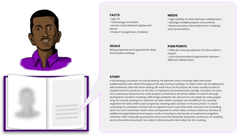
Students
While creating this persona, we wanted to embody the desires and frustrations that college students experience while using digital note taking platforms.
Working Professionals
Throughout the duration of creating the persona of working professionals, we wished to integrate much of the information we received from our interviews and surveys. Embedding the pain points such as viewing large collections of notes for projects.
Journey Maps
What is the student’s & working professional’s journey while using digital note-taking platforms?
Student
Working Professional
Design Requirements
Flexibility of viewing options
Depending on collection sizes, users need flexible ways to view their notes, whether that be grid, list, timeline, etc.
Provide organization features that enhances search
Searching for notes requires a lot of mental recollection on the users end.
Cross platform and device consistency
Users cannot perform certain actions within different platforms or devices. EX: Users can move/copy notebooks on Desktop and Mobile but are unable to do so Online.
Organizational collaboration
Note-taking doubles as a workspace. Users need efficient ways to work, communicate, and organize collaborative notes.
Phase 3: Ideate
Areas of Focus
Flexibility of Viewing Options
Identifying a method to viewing notes. Whether that be grid or list view, give the choice to the user.
Enhance the Search
Do not exhaust users recollection to find a specific note
Move/Copy Notes
Users are given the ability to move/copy between notebooks on Desktop and Mobile and are unable to do so Online.
Collaboration
Provide organization methods within collaborative work
Rationale
Assessing impact and effort to decide on a direction.
Collaboration
Within the unexpected turn of events in our world due to COVID-19, online collaboration spaces have become more common and to an extent, the new normal.
From our Competitive Analysis, we learned that some of OneNotes’s competitors, like Evernote already have an entity called, “Evernote Business,” for collaborative note taking. Also, Google possess a collaborative space with Google Drive, Docs, etc. and how that doubles as a work and note taking space. From our interviews, we gained more insight into some of the needs and wants of users, such as the importance of comments within their note taking and work flow. Plus, we gained an understanding on how people who use OneNote also use other note taking apps to satisfy their collaborative note taking needs.
Reframing our design question to address organizational collaboration
Design Question: How might we enable users to organize large sets of notes they create in collaboration with others?
Define: Organize
Enable users to collect, arrange, and make decisions between multiple ideas and thoughts.
Define: Collaborate
Streamline the process of two or more people or organizations working together to complete a task or achieve a goal.
Wireframes
Collaboration options
We found immense value and opportunity in exploring users ability to collaborate with their teams via Microsoft OneNote. With professionals and even students working on teams across the globe, virtually, accessibility and collaboration are key components in their usage.
Viewing options
Depending on various use cases, mental models, and scales of notes, users need flexible ways to navigate and view their collection of notes. The creation of a dashboard would show users more valuable information such as mentions & comments.
Participating options
From the research we conducted from interviews and surveys, we noticed an opportunity to integrate its features to enable users on OneNote to make quick decisions together within a note document.
.
Phase 4: Prototype
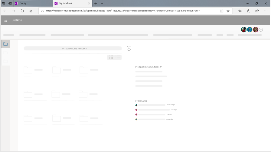
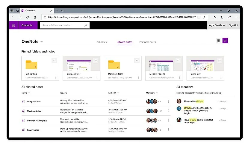
Dashboard Navigation
The OneNote dashboard is unique to the Online platform. The addition of more collaborative features means rethinking how to organize and display collaborative vs. personal notes.
We’ve also redefined what a note means to people by switching the idea of notebooks to folders to expand the idea of what a note can contain..
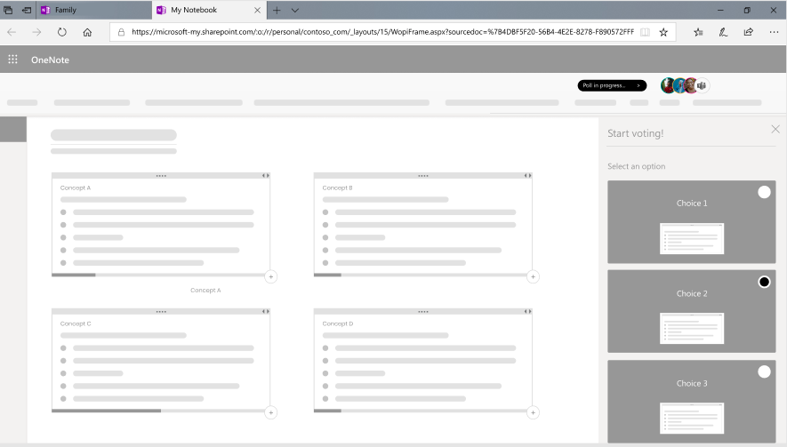
Microsoft Forms Integration Creating & Voting on a Form
We wished to expound on the opportunity for users, specifically working professionals to create forms, surveys, polls, etc. within their teams and receive feedback. This allows users to make collaborative decisions with the perspective of all members in mind.
Along with that, we developed a prototype for users to vote on these forms and share their suggestions or feedback. This empowers users and allow their voices to be heard.
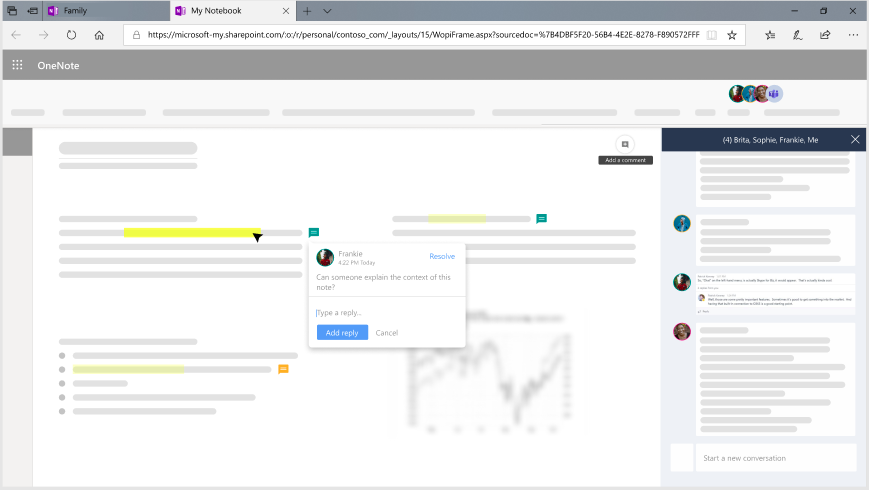
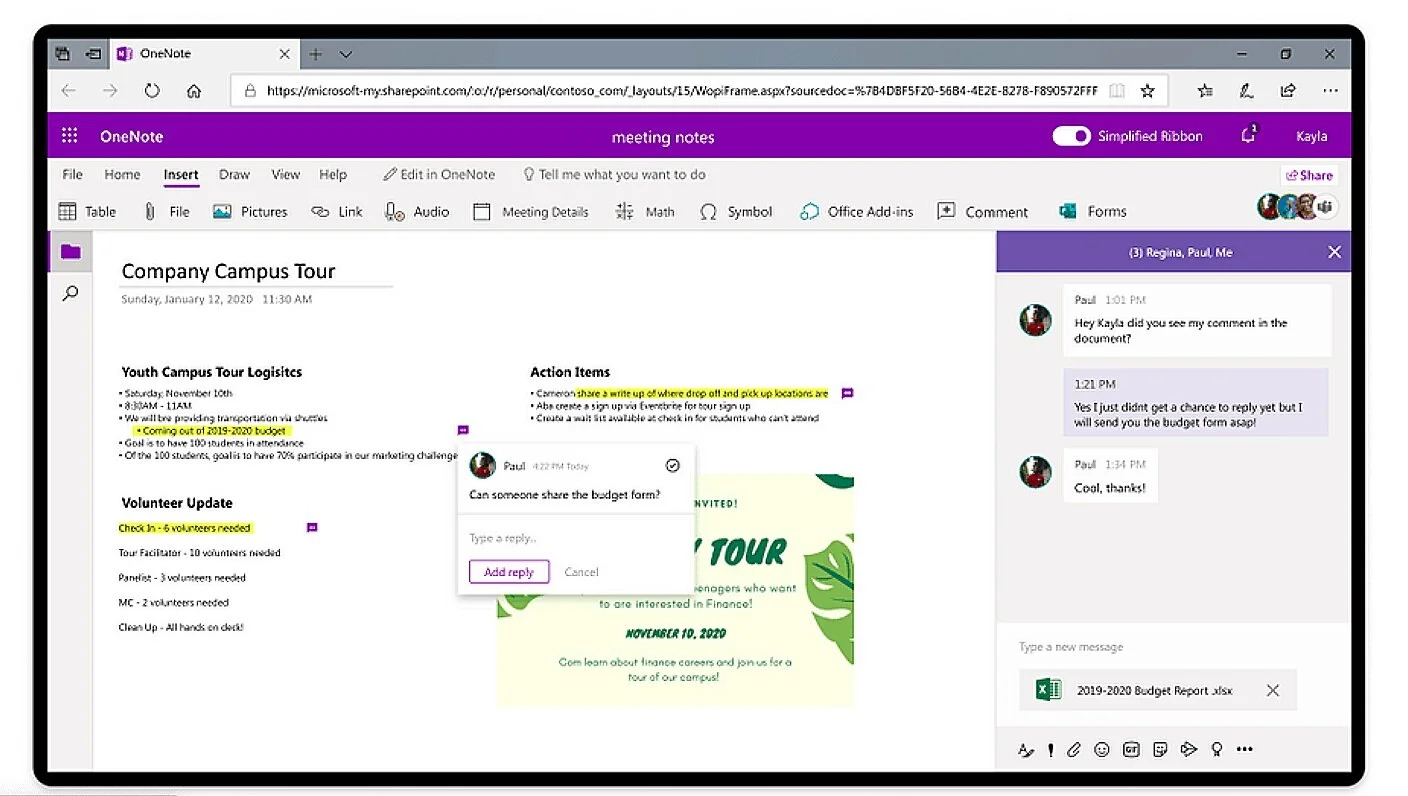
Teams Integration - Communicate and Comment
With the necessity of collaboration platforms between teams located all over the world, we wished to investigate the ability for users to comment on notes being used by group members. Also, we integrated Microsoft Teams which allows users to communicate seamlessly and efficiently while taking notes.
Phase 5: Test
Research Objectives
Reveal pain points within the user task flow when navigating our three new collaborative features on OneNote.
2. Validate assumptions made during the design process to ensure the new design is intuitive to users.
3. Identify parts of the process that delight users that should be kept in future releases
4. Uncover opportunities for improvement based on issues users come across
How might we get the most out of usability testing?
Conducting 5 authentic, yet similar User Tests where each user participated in these tasks.
Dashboard Navigation
Creating a voting form
Communicating through Teams integration
Voting on a poll
Viewing poll details
Marking complete/incomplete
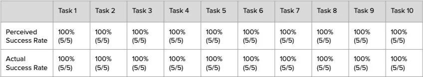
Success Rates
(Perceived and Actual)
After each task, we asked the participants if they think they have completely the task successfully. While the facilitator is asking that, the note takers are transcribing the participants’ answer, as well as marking if the user was actually successful.
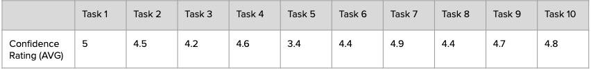
Confidence Ratings
After each task, participants were asked to rate their confidence level throughout completing the tasks on a scale of 1-5 (1 being not confident at all and 5 being very confident).
This rating is a follow up from their perceived success rate to gather qualitative feedback on what aspects of the task made them more or less confident about completing it.
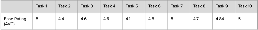
Ease Ratings
After each task, we asked the participants to rate the difficulty of the tasks and elaborate any portions of the task flow that made it more difficult, confusing, or helpful to reach the success of the task.
The rating was on a scale from 1 to 5 (1 being very difficult and 5 being very easy)
Notable Quotes from Usability Tests
“It would be nice to have a blurb to say list or grid view when I’m hovering.”
— Participant 1
“Very pleased with all the details of the notes content (members, last edited, etc)”
— Participant 3
“My first instinct was to look at the top menu because that is where you can insert other things”
— Participant 2
“Would be nice to see the count on the progress bars for the containers so that it could save me a click”
— Participant 4
Takeaways from Usability Testing
Users want to confirm their viewing selections
Participants expressed their concern with uncertainty on which viewing option they are about to see. Expressed wanting to have text to confirm their expectations on the button. Therefore, we added a small text that shows grid or list when users hover over the icon.

Users want to see exact vote count from progress bar & who voted
All participants were able to recognize the functionality of the progress bar but most of them struggled to quickly confirm the number of votes for each option rather than gauging the exact number from the progress bar or having to expand poll details. To assist the user, we implemented a hover feature that shows the exact number of votes on the form. Also, we found that there was an undeniable desire to know who voted for which option. Therefore me added a section that shows users who have voted and who has not within the form.
Users want consistent and familiar action placements
Most participants first looked at the ribbon in order to insert a comment about a note. There were Inconsistent icons regarding comments.

Users want to immediate visibility of form voting
When clicking on a notification to vote on a form, participants wanted immediate visibility of where to select and submit a vote.
Reflection
This was by far one of the most innovative and exciting projects I have had the privilege to be a part of. I learned a lot about the capabilities within Figma, Optimal Workshop, Sketch, and other programs we used to launch this project. I was able to improve on my interactivity skills, design and prototyping skills, as well as soft skills.
With this project being produced and completed remote due to COVID-19, it forced our team to be flexible and accommodating to one another. With the help of our amazing mentor, Mila Milam, we were able to create this amazing product in the span of 6 months. With more time, we would have explored the design capabilities of OneNote and enhancing the searching of various types of notes, which was a key opportunity we noticed early in our research. Also with a bit more time, we would have allowed our participants from the initial usability test experience the refined prototype that included much of their feedback. Plus, we wished to develop design explorations for the mobile usage of Microsoft OneNote.
With this being one of my first thorough and extensive design project, I am truly proud of the work we did and appreciative of the opportunity to have gained this experience.

(Left to Right): Iman Yusuf, Franklin Huynh, Khyree Watson, and Niat Emnetu.